
— Ривьера — Торговый центр
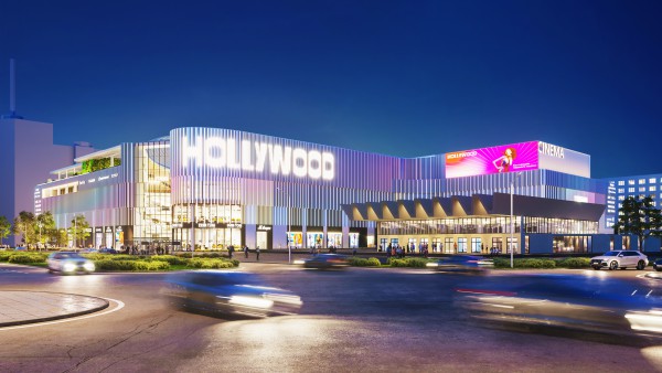
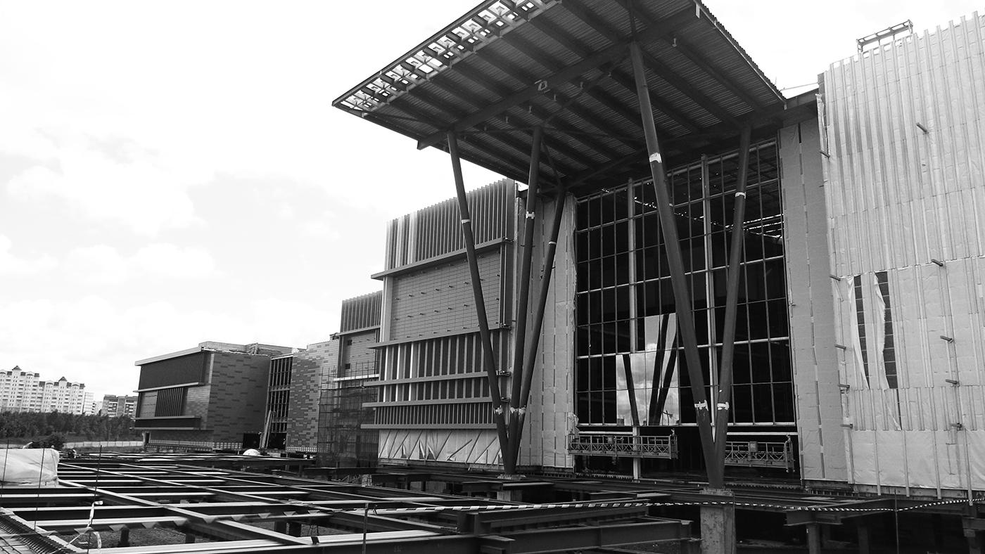
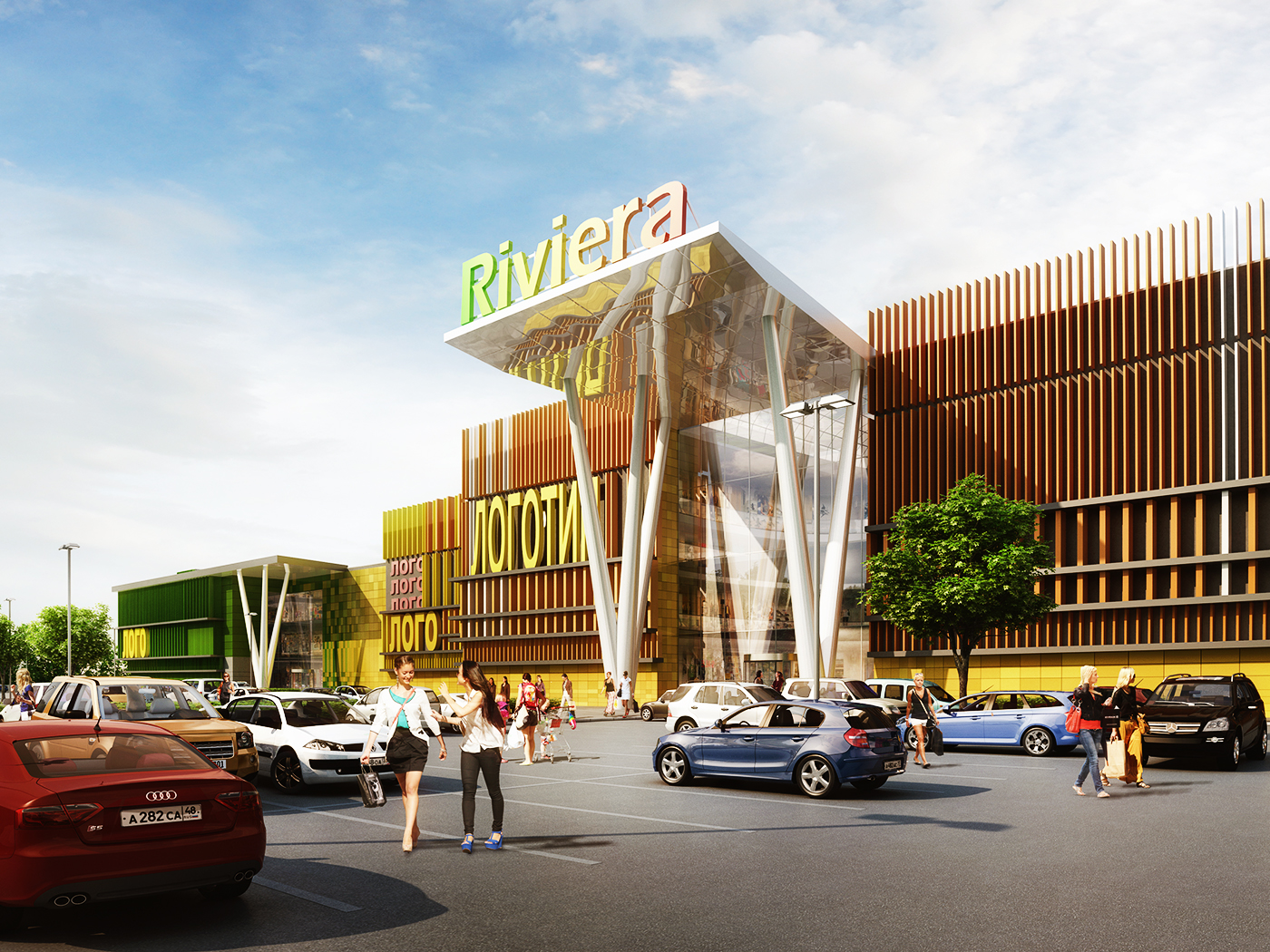
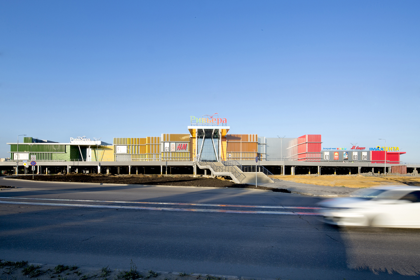
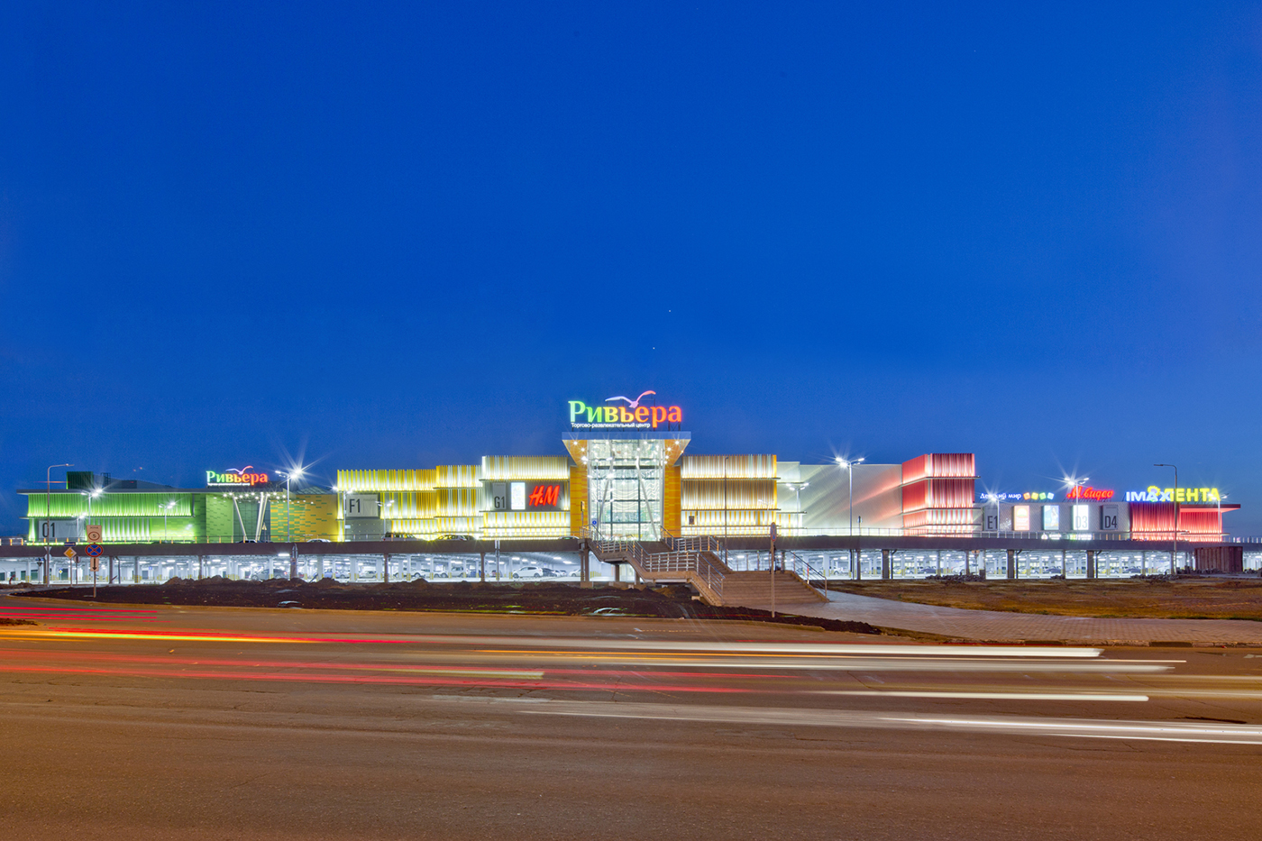
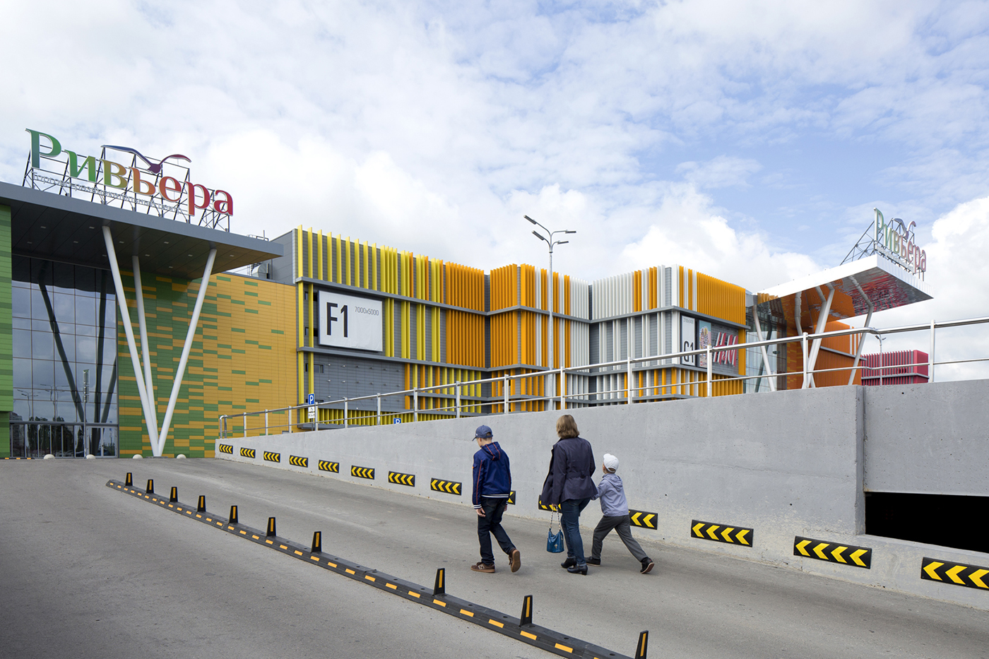
Когда мы узнали о том, что новый торговый центр в Липецке будет называться «Ривьера», мы сразу почувствовали основную идею проекта: его название напоминает о солнечных теплых днях, проведенных на пляже. В задачи Blank Architects вошло проектирование фасадов и интерьеров торгового центра. Вдохновением стали солнце, голубое небо, белый песок и разноцветные коктейли с маленькими бумажными зонтиками.
Концепция-Рай
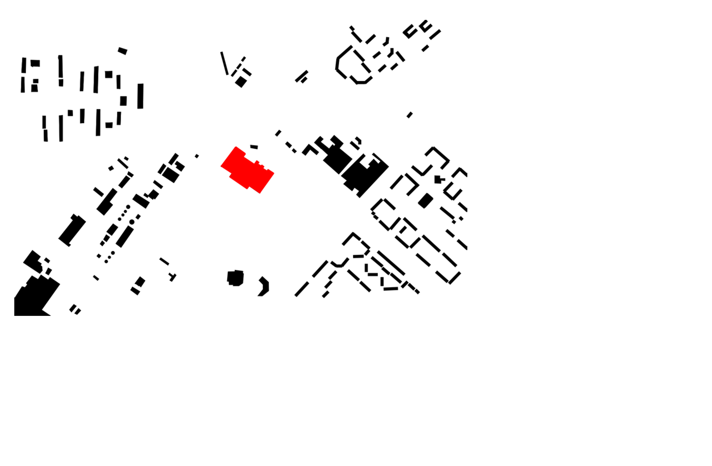
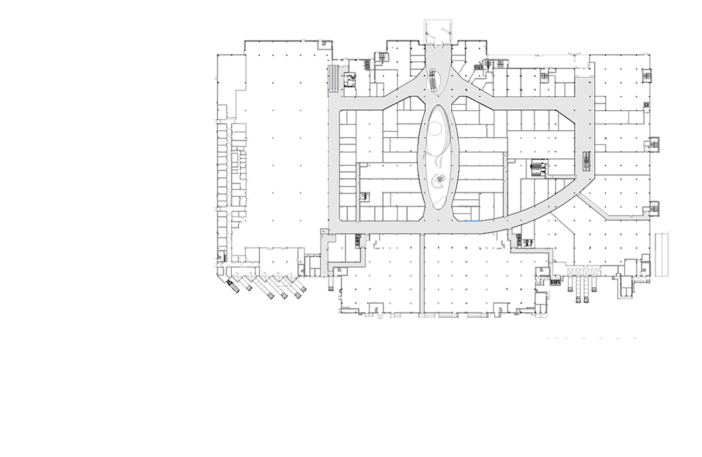
55 000 кв.м
Это идеальный мир отдыха, где легко можно представить, как покупатели совершают покупки в пляжной обуви даже в разгар русской зимы.
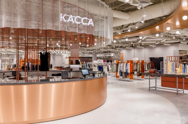
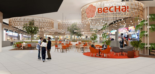
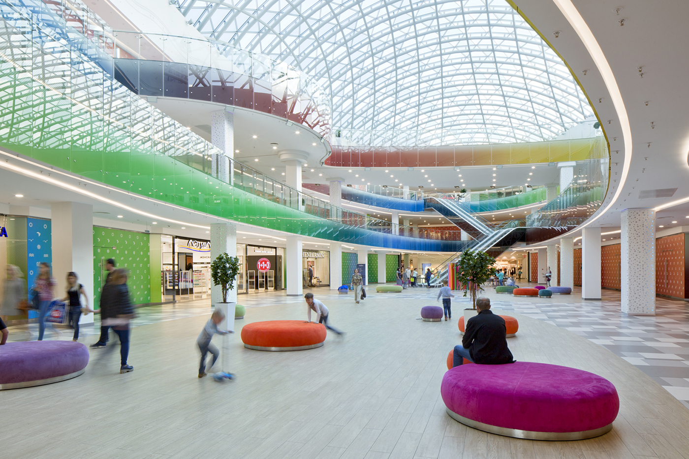
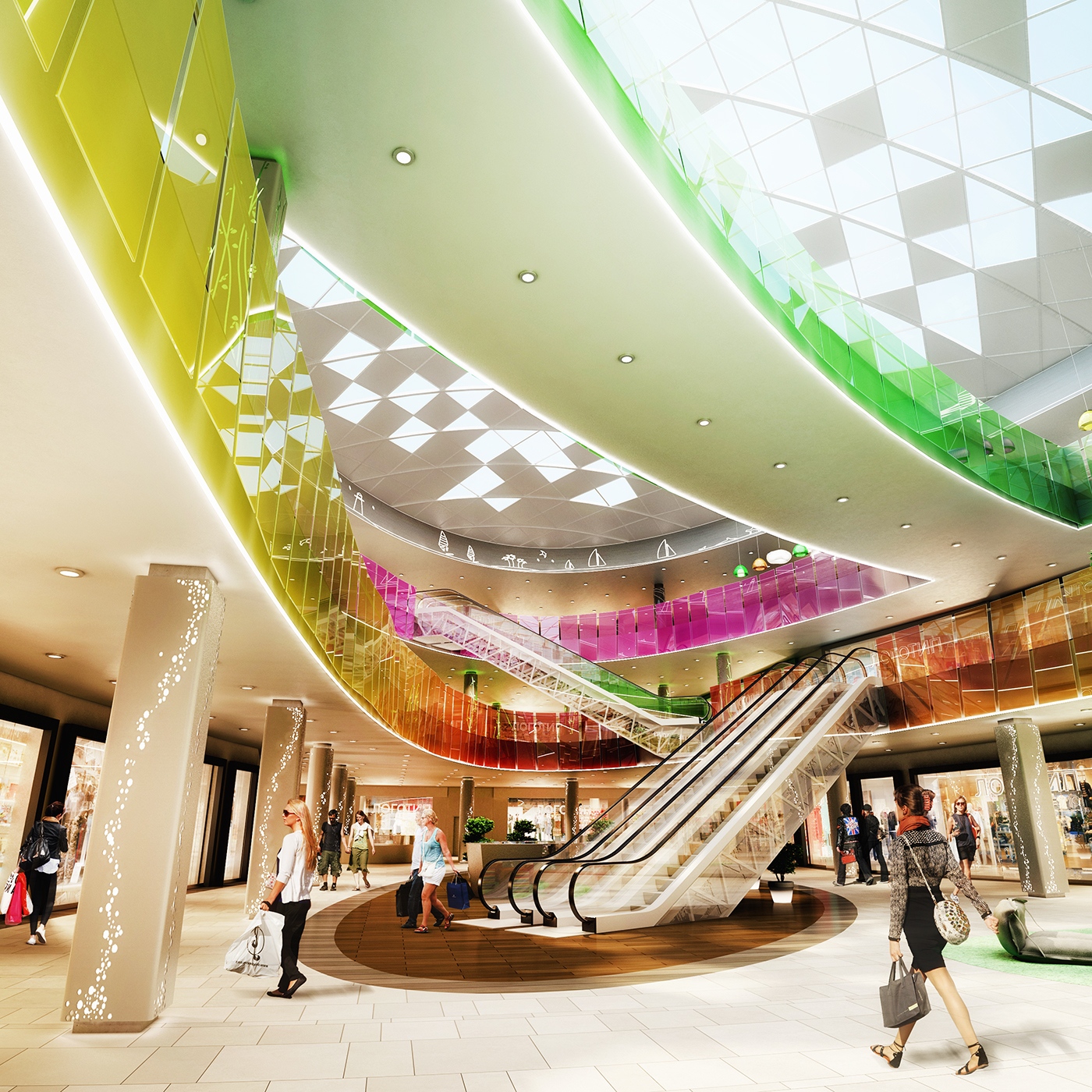
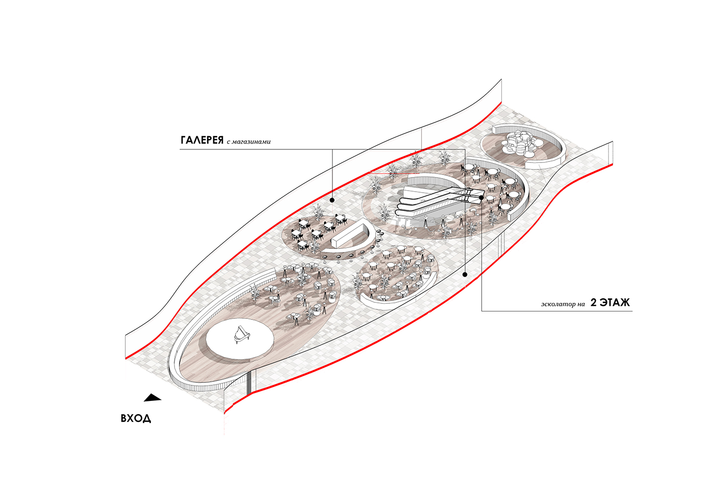
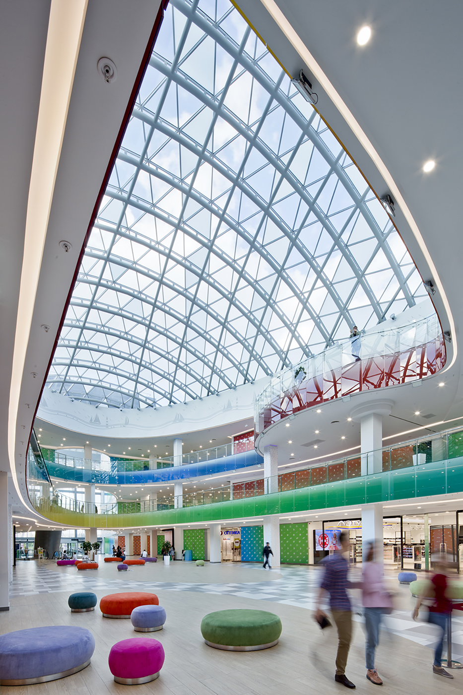
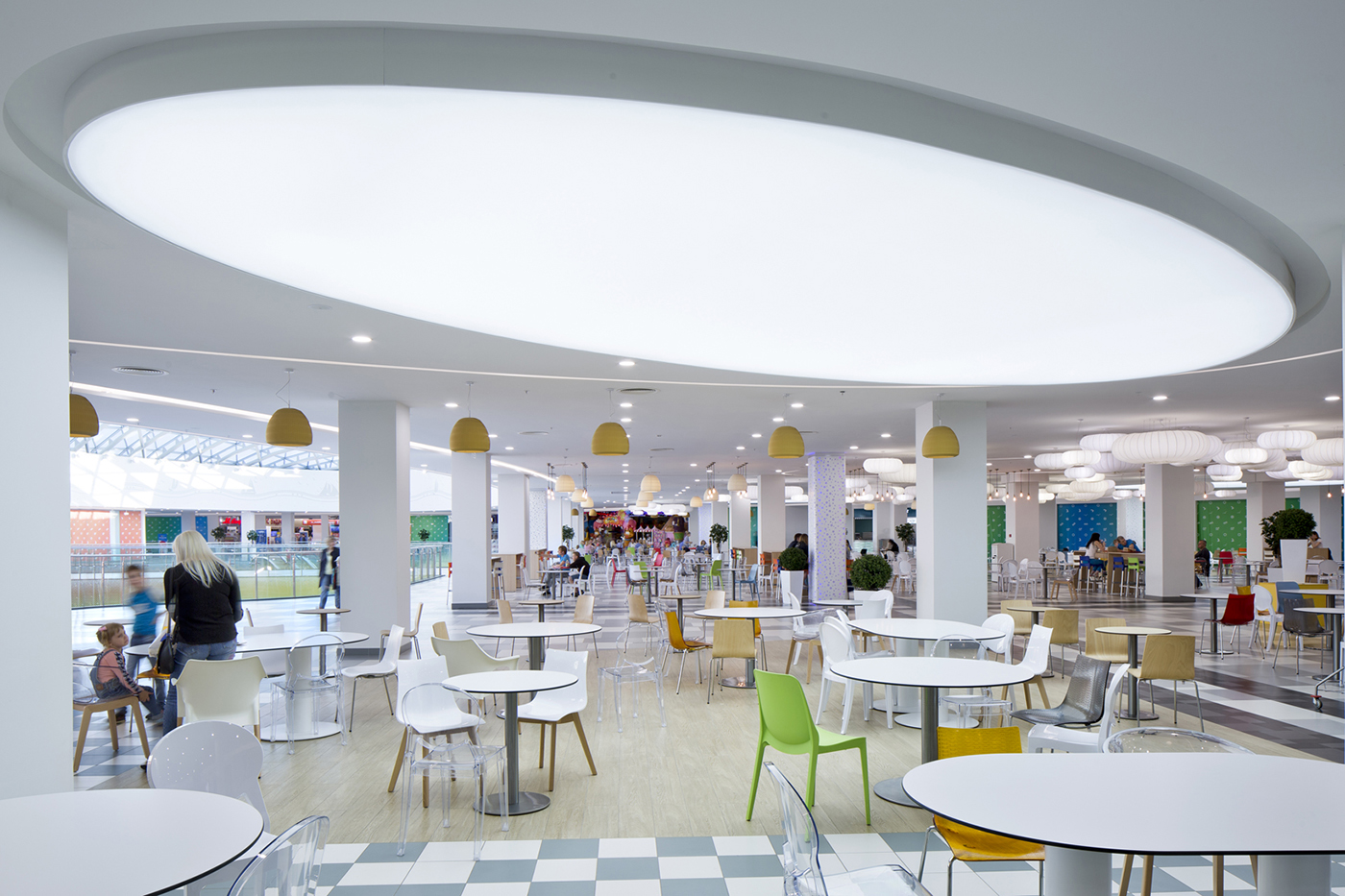
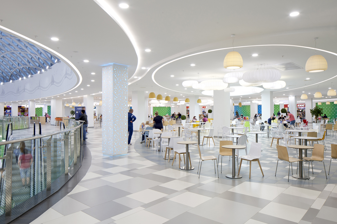
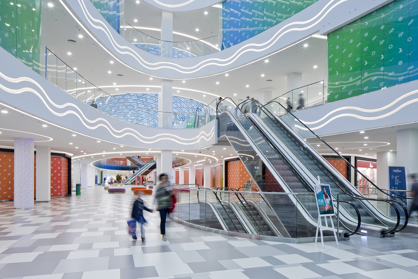
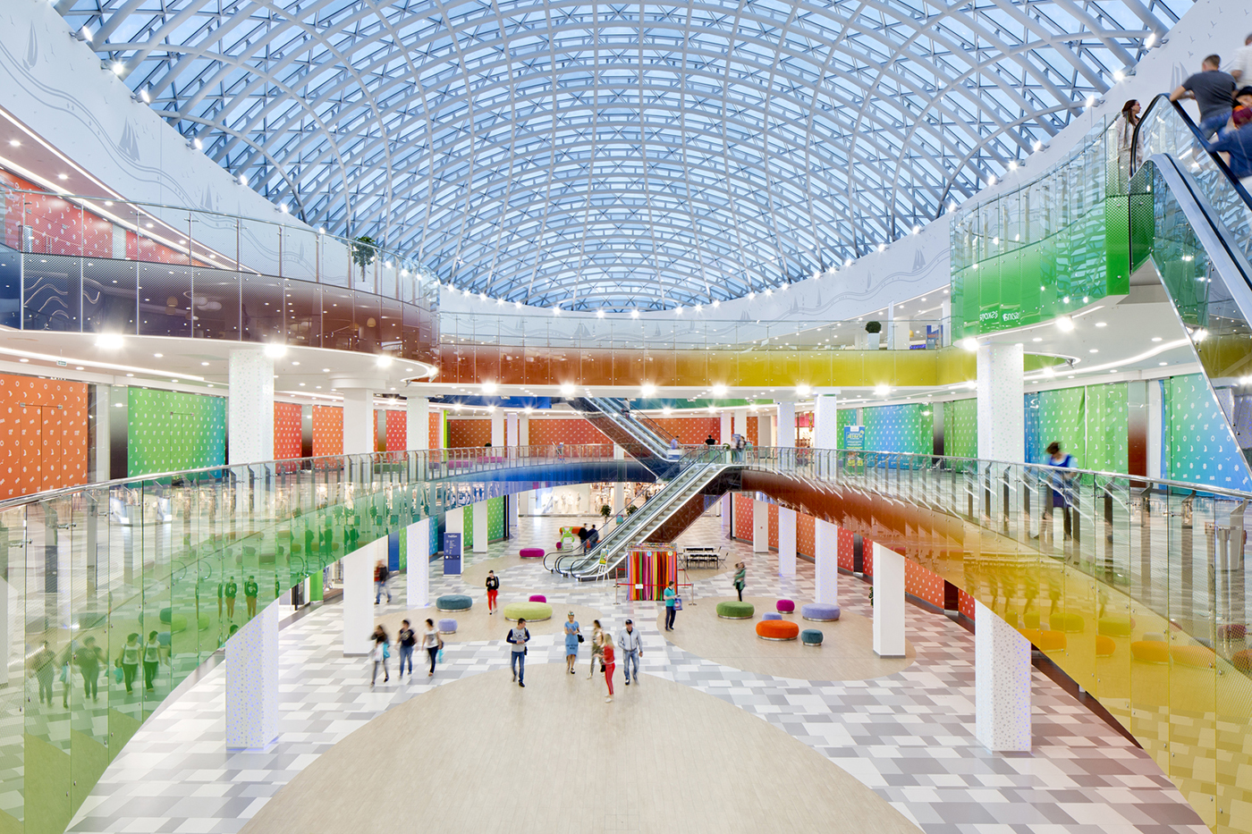
Интерьер – Детали, дерево и свет
33 000 кв.м
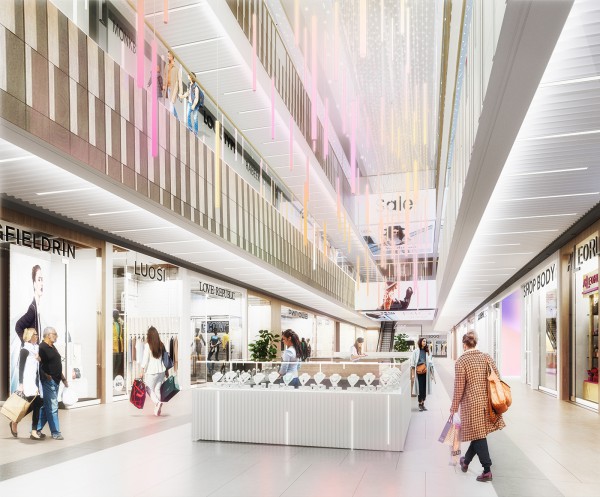
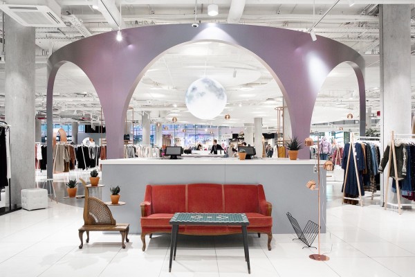
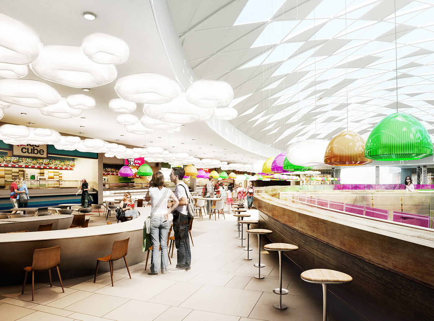
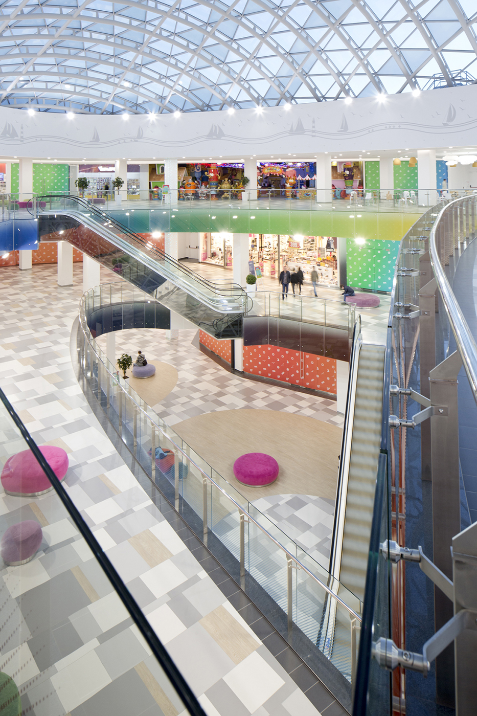
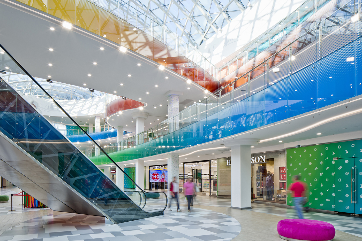
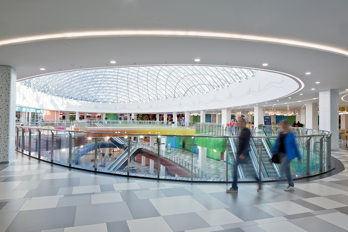
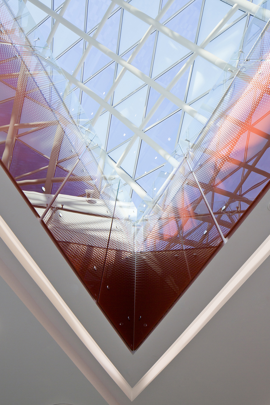
Оттенки неба, песка и яркие краски использованы и в интерьере торгового центра – в балюстрадах главного атриума и источниках света на фудкорте. В интерьере мы поместили больше деталей, чем на фасаде: это порталы торговых галерей, люстры, украшенные рыбками, узор из водных пузырьков на колоннах. Интерьер также имеет деревянные детали, которые напоминают конструкции паруса, наполненного ветром.
Conversation —
"Rivere" name as main inspiration
Tell us about the Lipetsk-based shopping center Rivere, what was the inspiration for the project and what it involved.
The shopping center’s name was the inspiration behind the project. When it was named "Rivere" we all felt like it was a good idea, as the name alone recalls sunny warm days spent on the beach. Our task was to design the facades and the interior for the concrete frame of the building that was built many years ago. Aiming to change the building into one of the best shopping malls in this part of Russia, we imagined the sun, the blue sky, some white sand, and colorful cocktails with small paper umbrellas in them.
How did you make this concept a reality?
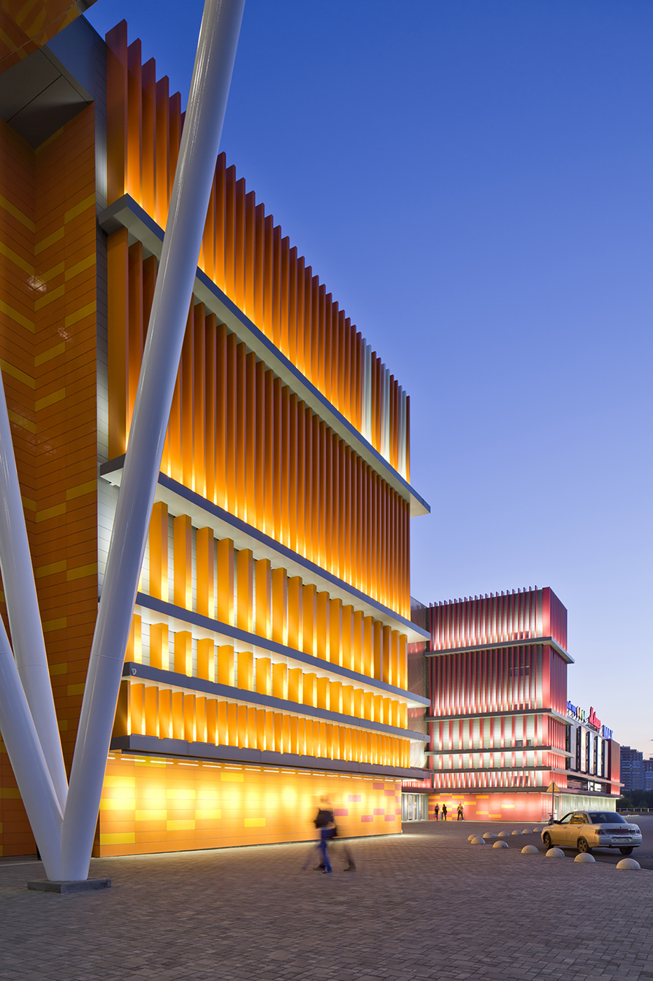
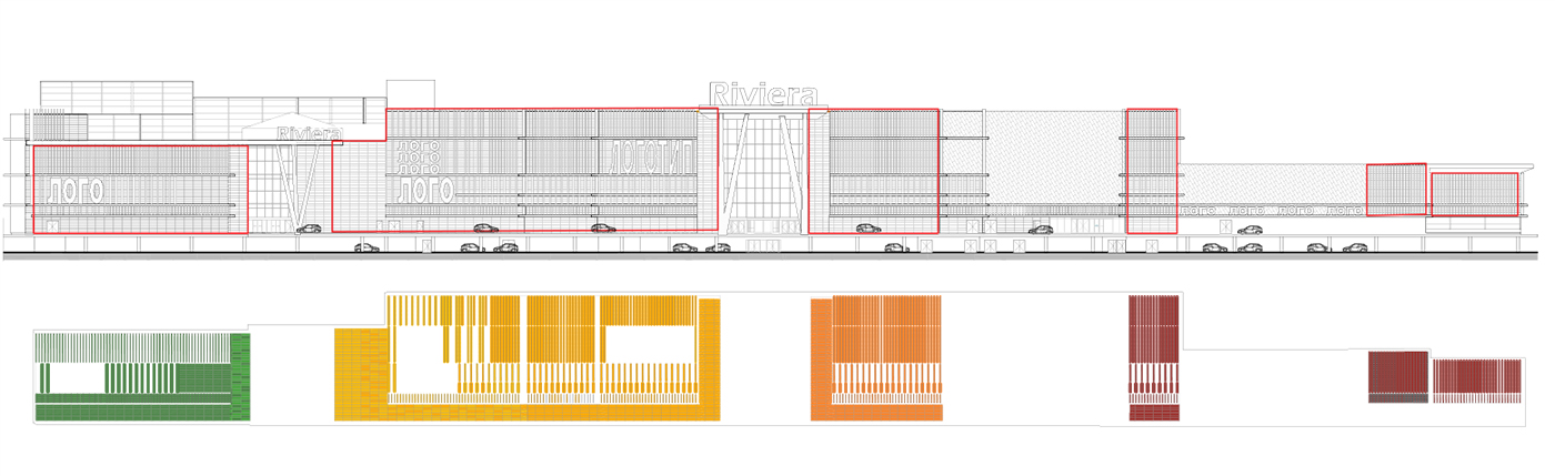
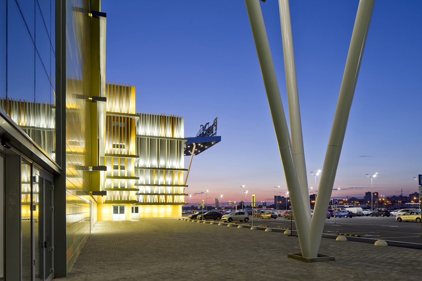
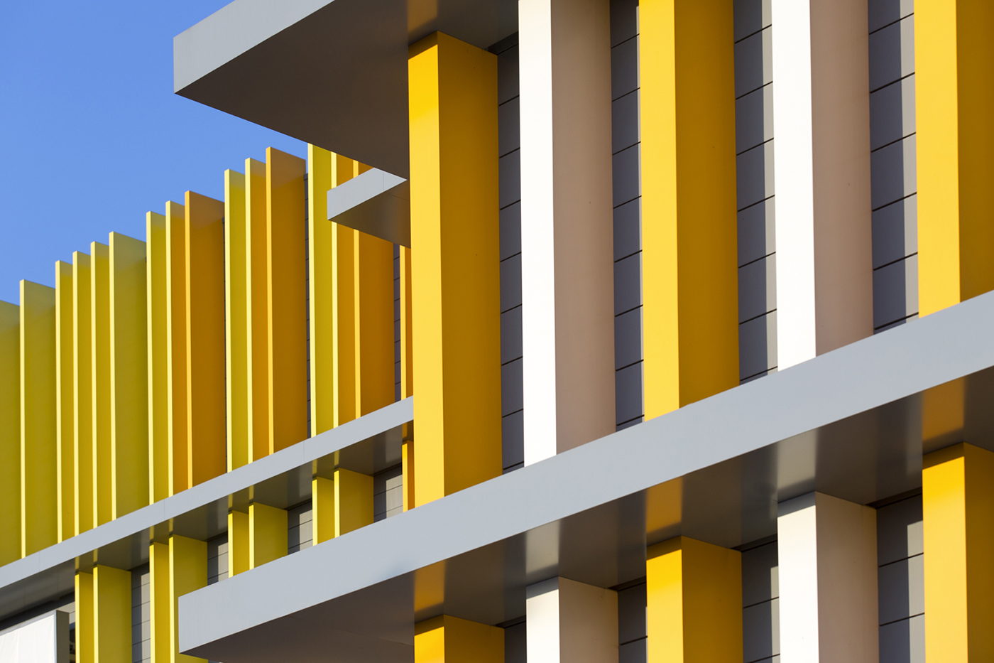
We created a façade bursting with the colors of fresh fruit, beginning with lime, moving through orange and kiwi and finishing with mango. The changes in color are gradual and they interlock with each other when they meet at the entrances of the shopping center.
Like a tropical starburst. What method did you use to make this colorful façade?
This orgy of colors was made possible by giving the façade a second external skin of vertical lamellas which are detached from the main wall. The lamellas’ density increases where the colors should be more intense, and decreases to fade the color, when needed.
It sounds very effective. Is the interior equally as colorful?
We certainly used the same colors in the interior. These are captured in details such as the glass balustrades of the main atrium and the lamp shades in the food court. But the interior has more details than the façade: framed shop fronts, fish-ornamented chandeliers, and a bubbles pattern on the columns. It also has wooden details and the lightness of a sail filled with the wind. We wanted to bring comfort, relaxation and a holiday atmosphere to Lipetsk every day with this interior design. So we created a concept that would allow customers to feel like they were at a seaside Riviera, rather than the banks of the Voronezh River.
It sounds like you’ve really created a tropical paradise…
Thank you. It has turned out to be a perfect holiday world which supports the brand’s name, and it is very easy to imagine customers doing their shopping there in flip flops, even in the middle of a Russian winter.
I can picture it well!