

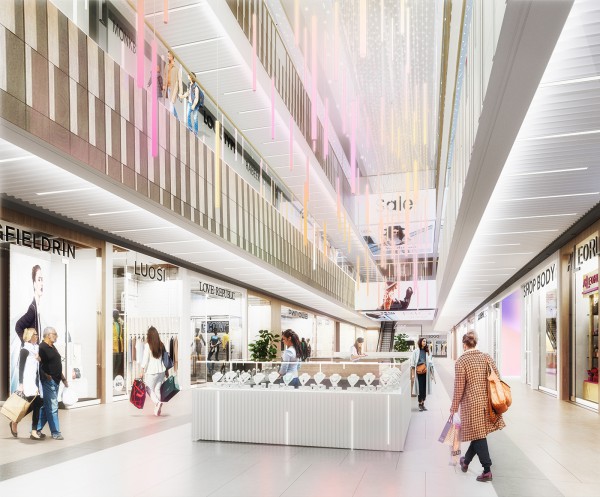


— Troika – Shopping Center
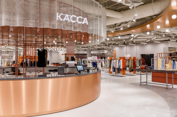
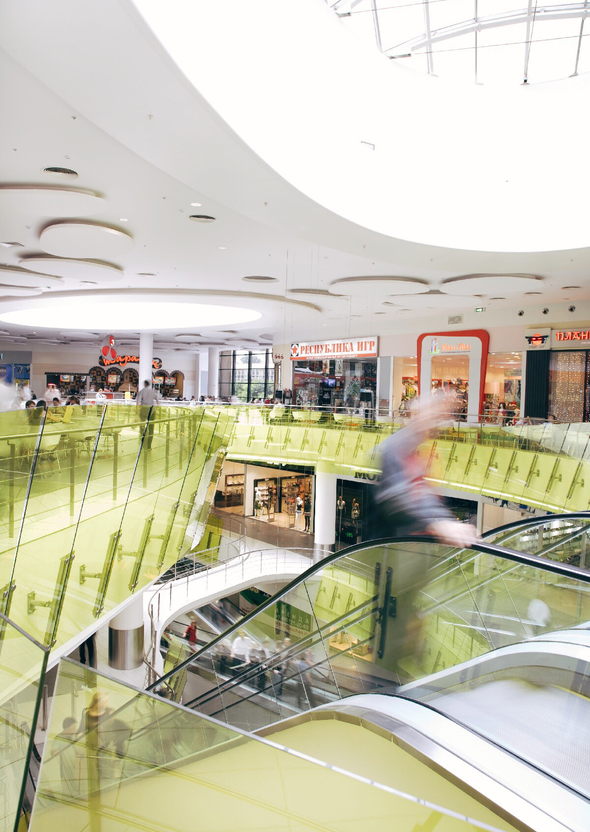
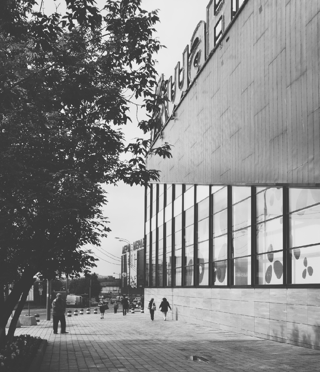
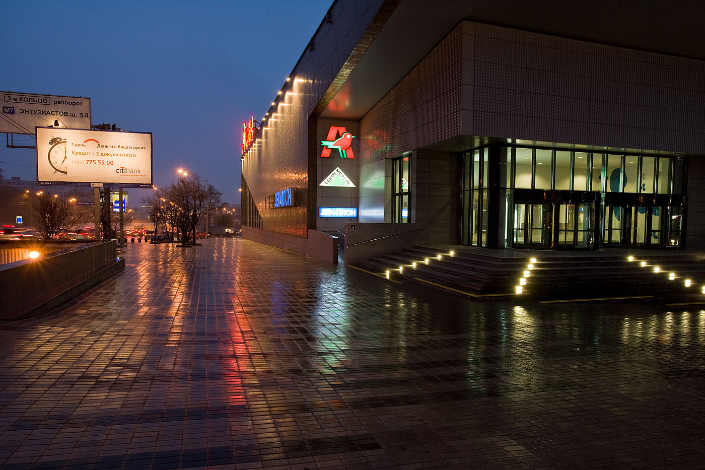
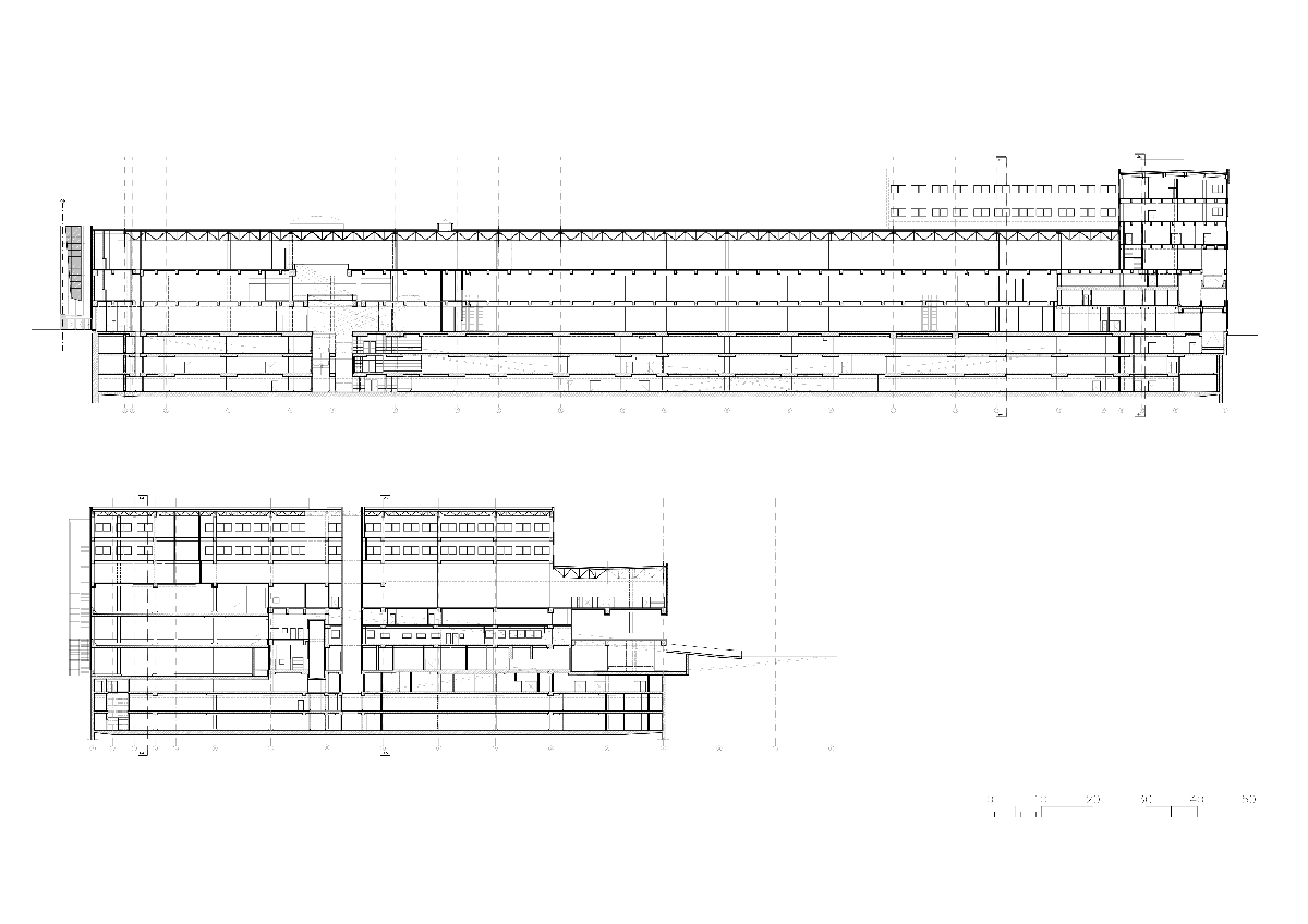
The “Troyka” shopping mall is located in Moscow, on Verhnia Krasnoselskya Street, a 10-minute walk from the Sokolniki metro station. The building is designed with 3 underground parking levels comprised of 1200 parking places and 3 floors of retail space. The total size is 150 000 m2 GBA, 45 000 m2 GLA. The building was finished and opened to the public on the 5th of November 2008. The floors of retail space have more than 130 boutique units, a double floor supermarket “Auchan,” a home improvement store “Leroy Merlin” on the 3rd floor, and a food court with a number of restaurants and cafes. All 6 floors provide easy access for clients coming by car and public transportation.
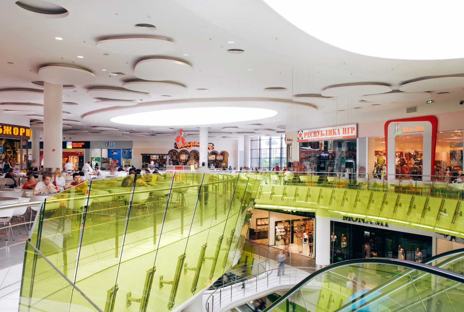
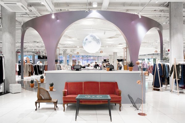
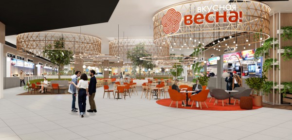
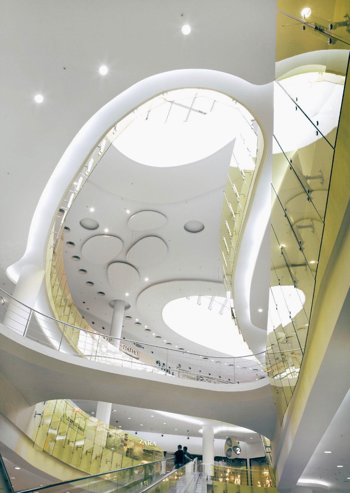
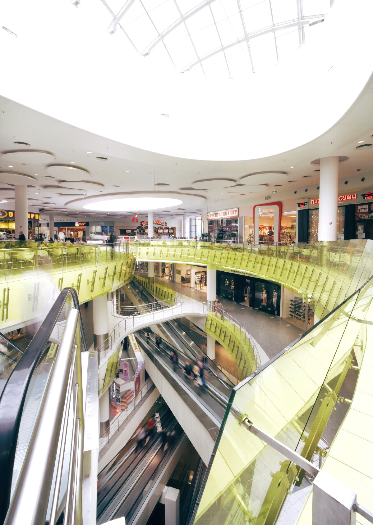
The proper saturation of the space with natural light, provided by the skylights, makes the clients want to stay longer.
Conversation —
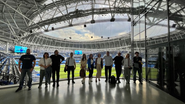
We Wanted this Building to Live


The Troyka shopping center seems like a very large structure. When you were designing it, what kind of customers did you have in mind?
At the time it was one of the largest shopping malls in all of Russia! The Troyka shopping center was created for dynamic, modern customers and provides a wide range of shopping possibilities. The project accommodates a two-level hypermarket, a building materials and decoration store; a sporting goods store and 98 boutiques for fashion and accessories. All of that completed with differentiated services guarantees a comfortable and joyful shopping experience.
Did you face any special challenges while designing it that required especially innovative solutions?
The mall is unique as it has 3 underground levels of parking with very bold fire safety solutions - there are almost no fire safety walls, and 3 levels of shopping above the ground floor. It also has a 2-floor supermarket inside and home improvement store on the 3rd floor. The latter required a great deal of creativity from our structure designers as it had to be built to bear huge loads of up to 1500kg per square meter!
Wow, that is an engineering feat! I was wondering, when designing such a large and varied commercial space you must have wanted to have an overall unifying theme. How did you pull together all of these places under one roof and give them one look?
Right we wanted this building to live. To have customers moving around within in it day and night. The rough and sharp facades on the exterior are a direct result of the plot shape and the visibility restrictions of the nearby church. But inside the building has a soft and very organic interior that intuitively follows a carefully studied customer flow. Every design decision was made to enhance this flow and direct it to fill in every corner of the mall with customers. Every single step of the customer has been predicted and the interior design has been planned so as to stimulate the occupant’s eye. Each shop front has its moments when they are seen by the client while he or she is moving up or down through the center.
Every shopping center needs a place for customers to rest and relax while shopping. What steps did you implement to achieve that here?
The food court contains twelve restaurants and cafes and is located at the top level of the shopping center. The largest skylight in the building sits over it, which also provides a view of the city. The natural light and view make this a very pleasant place for lunch or coffee.
The complex is supplemented with three levels of underground parking for 1500 cars with easy and convenient access to the upper commercial floors.
How did you increase the flow of customers?
This was accomplished by filling in the atriums with travelators and escalators that constantly transport customers between floors. This was a decision based mostly on rational and functional aspects, while also clearly underlining associations of this building with a living organism.
Were steps taken to balance the busyness of the shopping center with the organic aspect of the building as a whole?
That is an interesting question and I can tell you how we achieved it. The proper saturation of the space with natural light, provided by, the skylights makes the clients want to stay longer. We used subtle and calming decorations that, properly arranged with the use of smooth and feminine lines, allows the eye to rest from the colorful and vivid shop fronts.
And I see that you won an award for its design.
Yes, it was awarded the 3rd prize as part of the 8th edition of the Casalgrande Padana Grand Prix. We entered it in the ‘Large shopping area and management center category’ and were very happy it was so well-received.