
— Riviera — Shopping Center
When the Lipetsk based shopping center was named "Rivere" we all felt like it was a good idea. The name recalls sunny warm days spent on the beach.
We were trusted with designing the facades and the interiors. We imagined the sun, the blue sky, some white sand and colorful cocktails with small paper umbrellas in them.
Concept – Paradise
55 000 sqm
We imagined the sun, the blue sky, some white sand, and colorful cocktails with small paper umbrellas in them.
This is a perfect holiday world created to support the brand name, and you can easily imagine customers doing their shopping in flip flops, even in the middle of a Russian winter.
Interior –
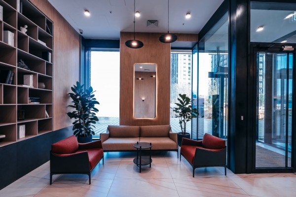
Details, wood and light
33 000 sqm gla
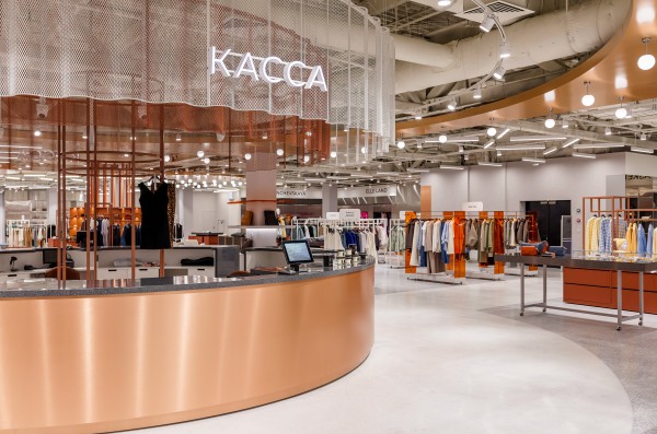
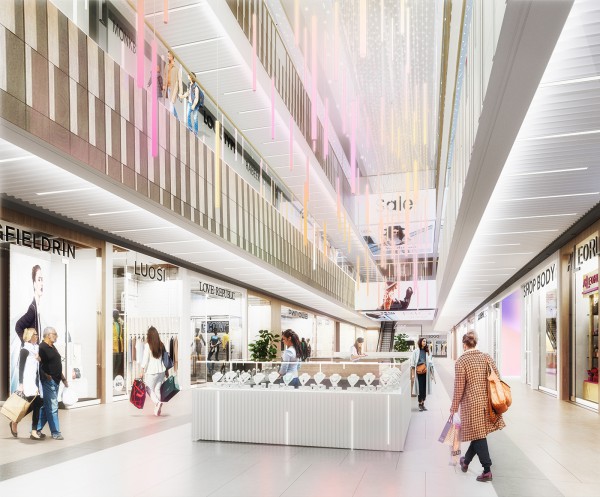
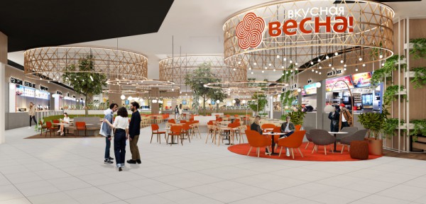
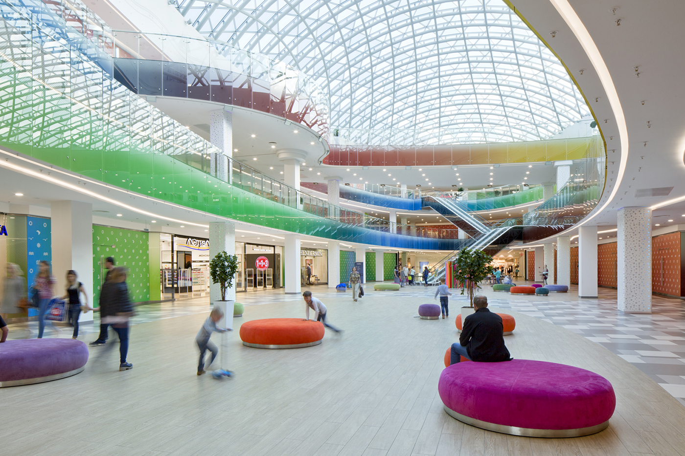
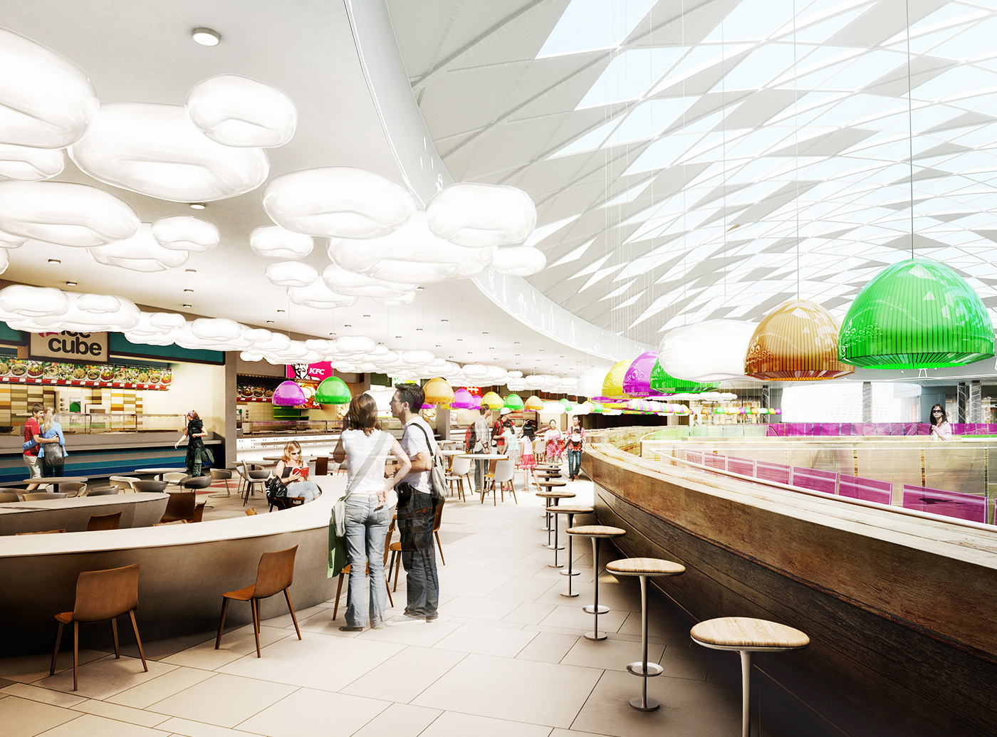
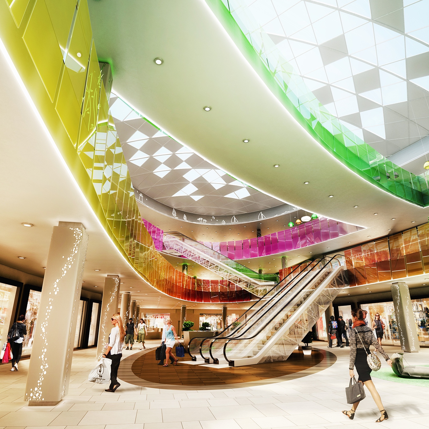
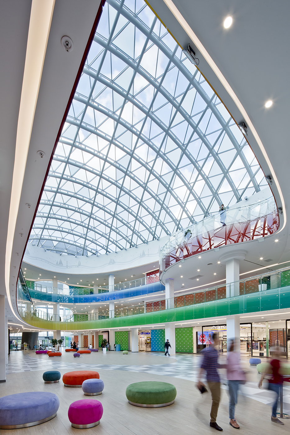
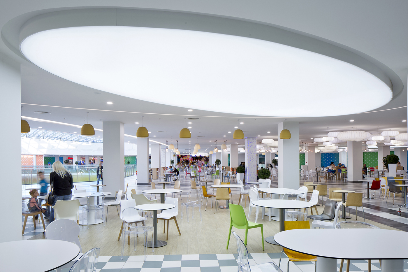
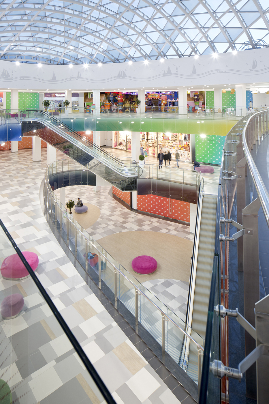
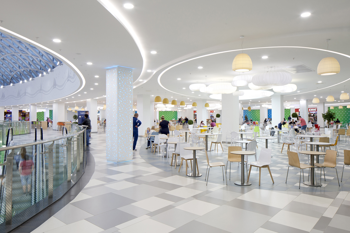
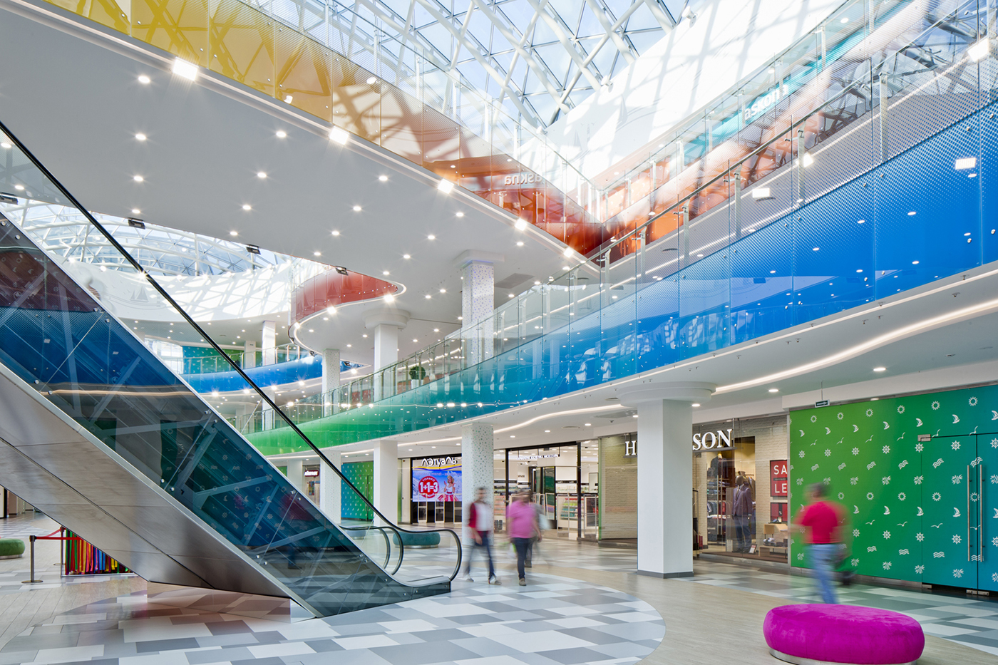
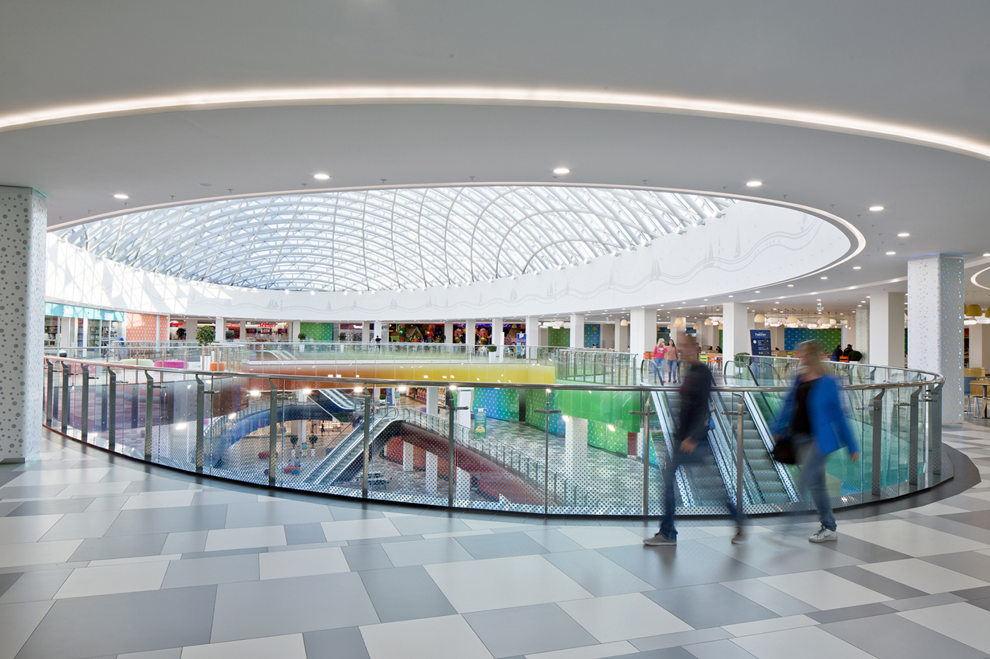
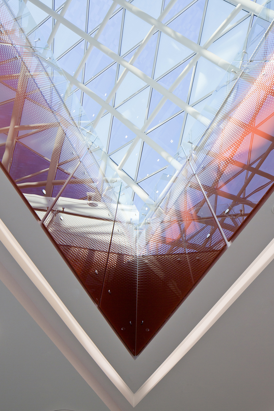
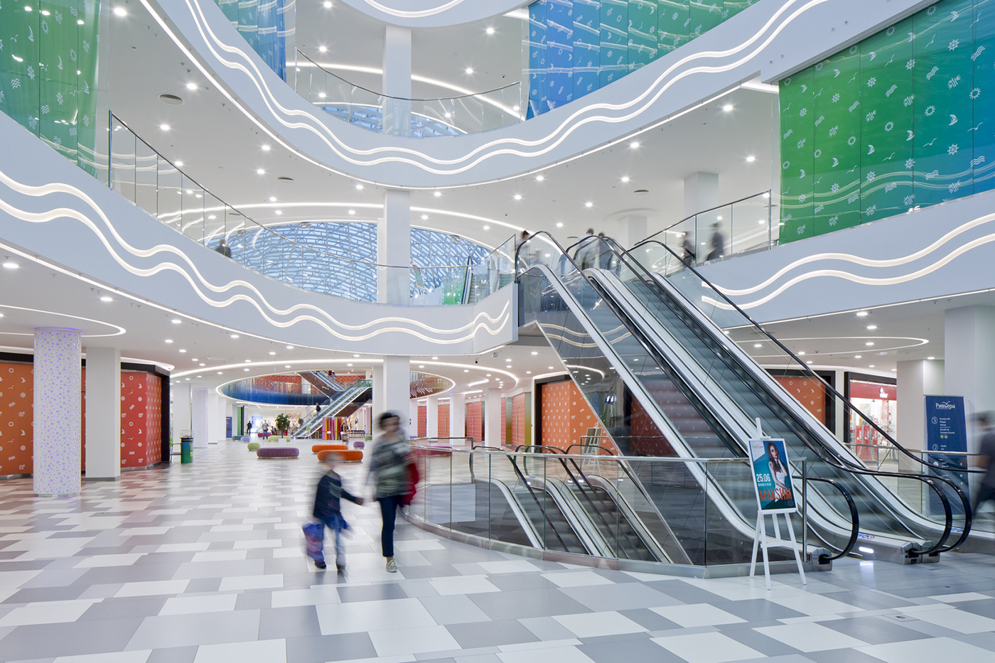
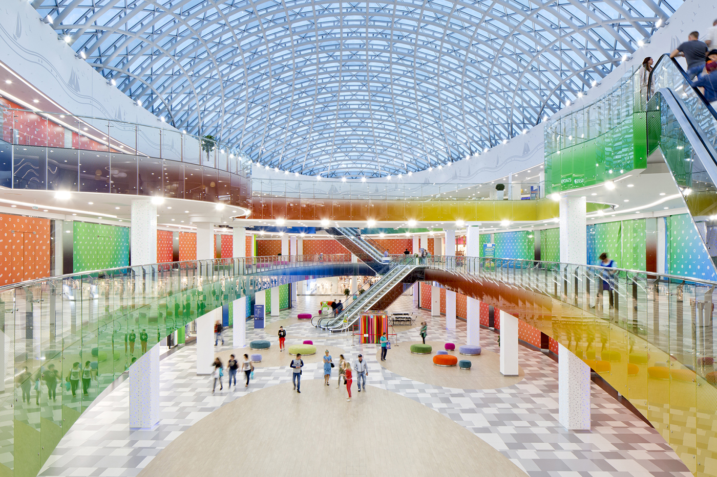
The same colors are used in the interior, captured in the glass balustrades of the main atrium and the lamp shades in the food court.
The interior has more details than the façade: the framed shop fronts, fish-ornamented chandeliers, and bubbles pattern on the columns. It also has wooden details and the lightness of a sail filled with the wind.
Conversation —
"Rivere" name as main inspiration
Tell us about the Lipetsk-based shopping center Rivere, what was the inspiration for the project and what it involved.
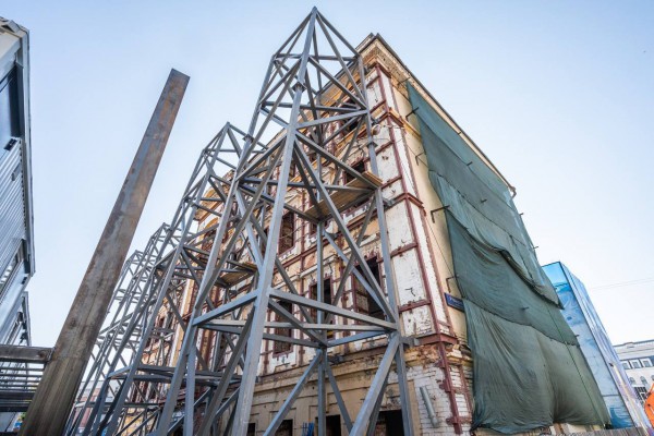
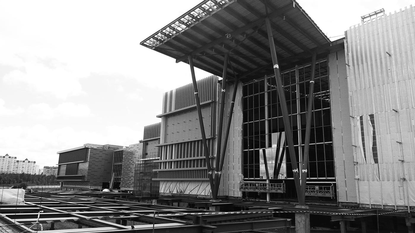
The shopping center’s name was the inspiration behind the project. When it was named "Rivere" we all felt like it was a good idea, as the name alone recalls sunny warm days spent on the beach. Our task was to design the facades and the interior for the concrete frame of the building that was built many years ago. Aiming to change the building into one of the best shopping malls in this part of Russia, we imagined the sun, the blue sky, some white sand, and colorful cocktails with small paper umbrellas in them.
How did you make this concept a reality?
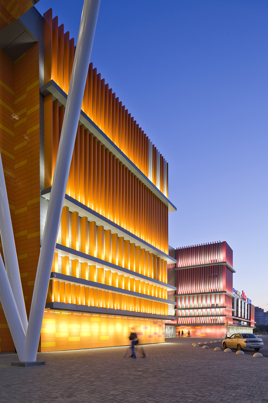
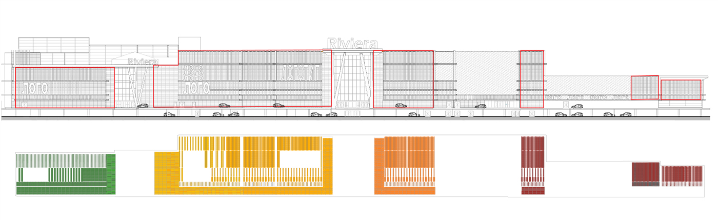
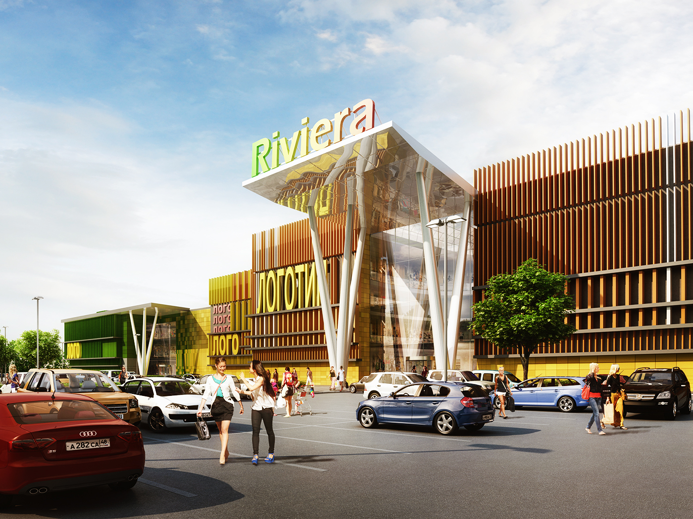
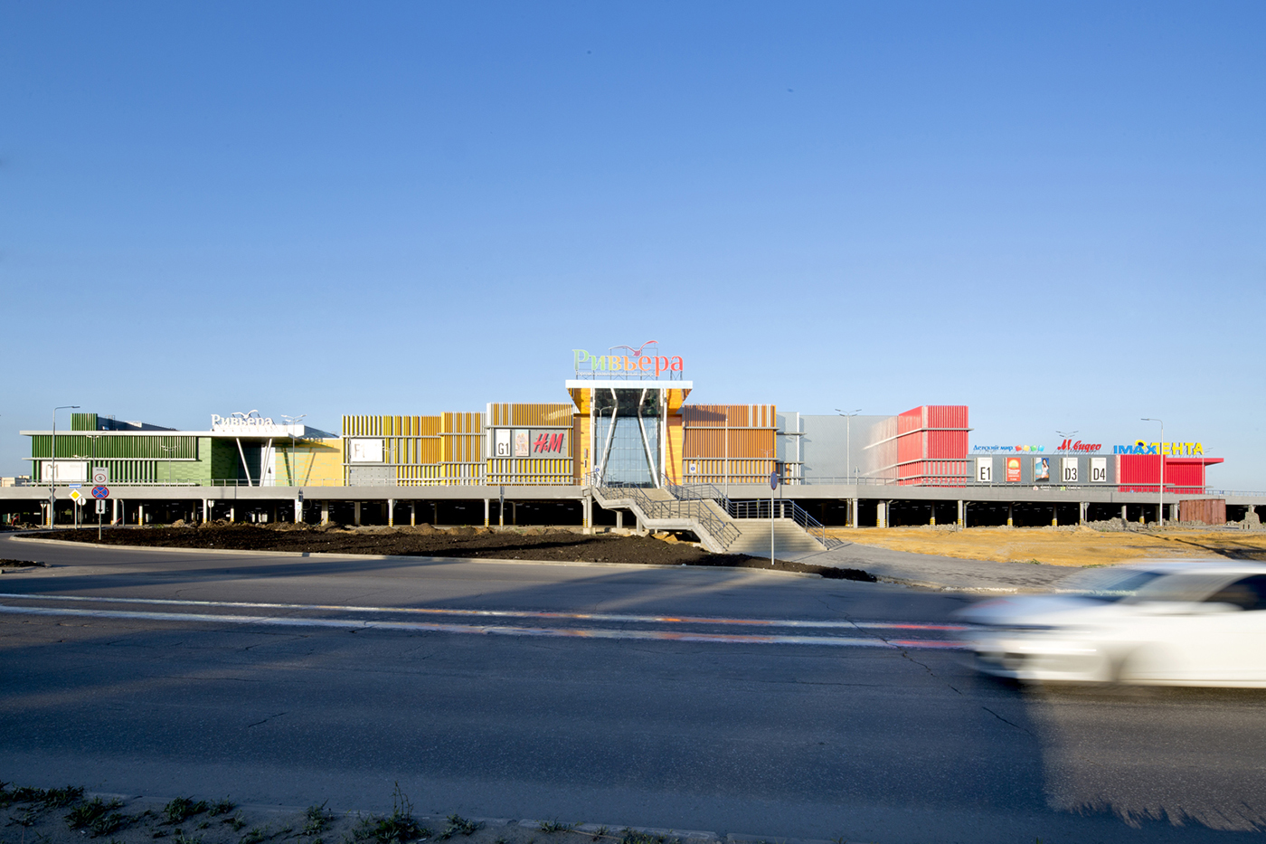
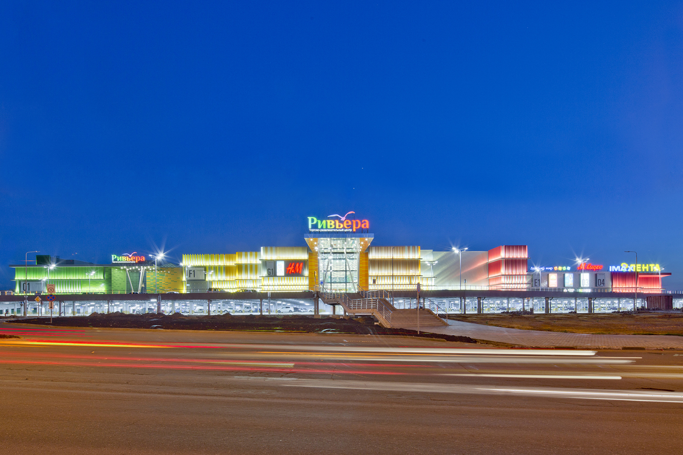
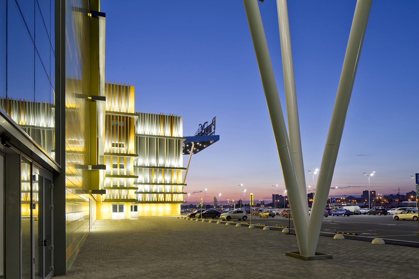
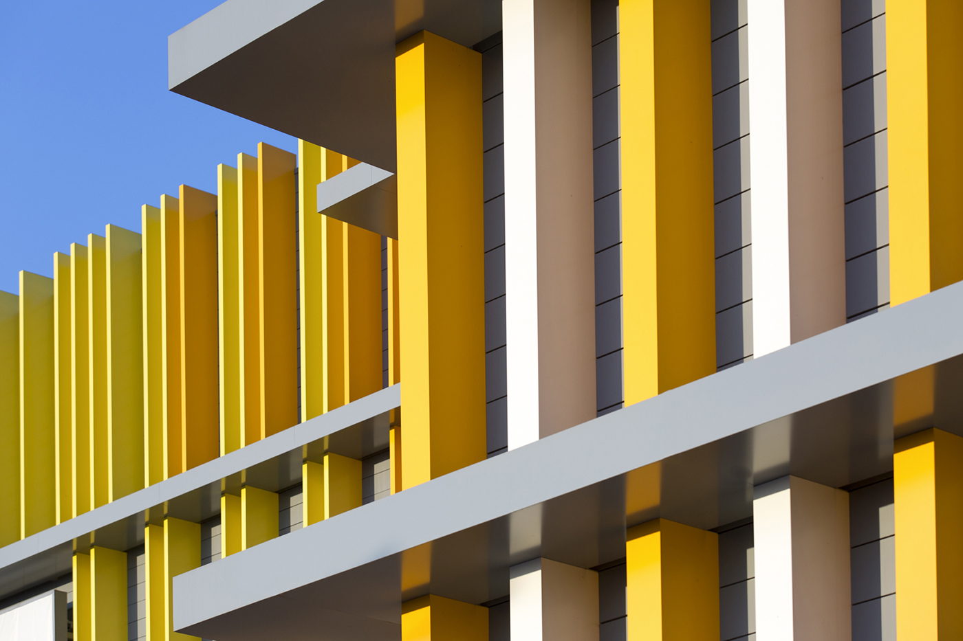
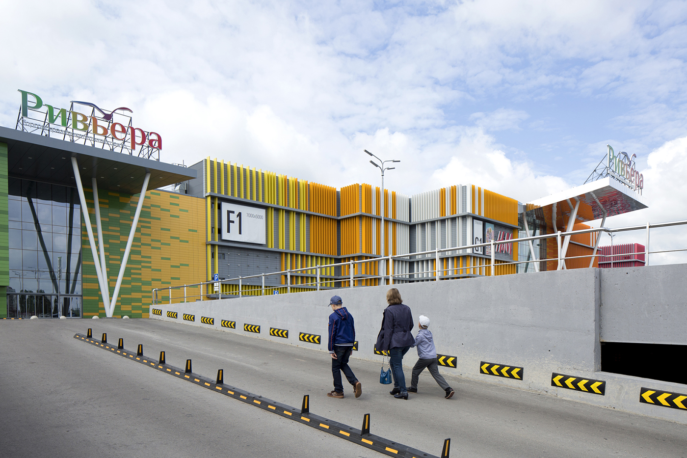
We created a façade bursting with the colors of fresh fruit, beginning with lime, moving through orange and kiwi and finishing with mango. The changes in color are gradual and they interlock with each other when they meet at the entrances of the shopping center.
Like a tropical starburst. What method did you use to make this colorful façade?
This orgy of colors was made possible by giving the façade a second external skin of vertical lamellas which are detached from the main wall. The lamellas’ density increases where the colors should be more intense, and decreases to fade the color, when needed.
It sounds very effective. Is the interior equally as colorful?
We certainly used the same colors in the interior. These are captured in details such as the glass balustrades of the main atrium and the lamp shades in the food court. But the interior has more details than the façade: framed shop fronts, fish-ornamented chandeliers, and a bubbles pattern on the columns. It also has wooden details and the lightness of a sail filled with the wind. We wanted to bring comfort, relaxation and a holiday atmosphere to Lipetsk every day with this interior design. So we created a concept that would allow customers to feel like they were at a seaside Riviera, rather than the banks of the Voronezh River.
It sounds like you’ve really created a tropical paradise…
Thank you. It has turned out to be a perfect holiday world which supports the brand’s name, and it is very easy to imagine customers doing their shopping there in flip flops, even in the middle of a Russian winter.
I can picture it well!